Wednesday, May 30, 2012

Panel Process


Here's a behind the scenes look at the process for creating part of a panel in The Moon Prince (it's actually a bit of a teaser since it's from a page that hasn't been published yet!). The image starts with a quick rough sketch, as shown in image #1 the grid below, then I shoot a reference photo (image #2) using a model (in this case, it's my son, Max). Next, I make a collage using the photo and a 3D rendering of the background (#3). Then I make a drawing based on the photo (#4) -- and here's where things get a little tricky.

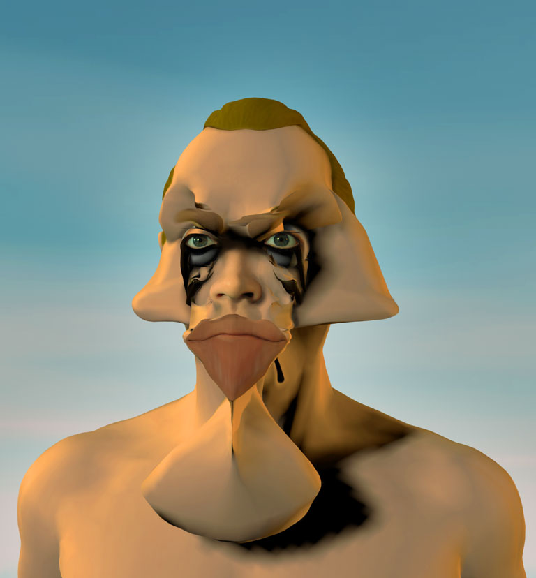
Drawings based on photographs often look awful - they're frequently distorted because of the camera lens or perspective, and details that look just fine in a photo can look strange or awkward in a drawing. To fix this, I use the Liquify filter in Adobe Photoshop, which allows me to smoosh the drawing around to my heart's content until everything looks "right" to me (#5). Then I add texts, background drawing and color to finish up (#6). 

To make it easier to see how Liquifying works, I made a little animated gif that cycles between image #4 and #5. For anyone used to drawing comics the traditional way - with ink on paper - altering a drawing this way probably seems weirdly reversed, because it treats a "tight" ink drawing as though it was still "loose" pencils, making the end of the drawing process seem more like the beginning!


(You can click on either illustration to see larger versions)


Wednesday, May 23, 2012

Weird Background Painting: Self-Portrait


This week's episode of The Rough Pearl shows Adam waking up with a nasty hangover in his bedroom. There's a weird painting in the background, just over a dresser, which is based on a digital image called "Self Portrait" I made back in 2000. It's a combination of a rendered image of a head with a photograph of my own face - like so:


Wednesday, May 16, 2012

Portrait of Melissa as a Mexican Movie Star


I haven't posted any paintings in a while, so here's a new one, "Portrait of Melissa as a Mexican Movie Star." It's based on a digital image I made back in the 90's, which in turn was based on a "lobby card" for an old Mexican movie which I bought at a thrift store in LA. The painting is about 30 x 40 inches, acrylic on canvas. (Apologies for the crappy camera phone picture!)


Wednesday, May 9, 2012

A Process Post: Fantastic Life Page 5


Here's another pile of my dirty laundry, also known as a process post. In this little animation, you can see me struggling to improve my stiffly posed and badly proportioned drawings for the fifth page of my graphic novel Fantastic Life (buy it HERE! I've got a basement full!).

I started with a pencil drawing on a 16 x 20" sheet of 100 lb. bristol board which I scanned at 300 dpi (I wrote and drew these pages at the same time, so there are no separate "thumbnail" sketches for them). Then I added a lot of contrast using a color correction Curve, and used other Curves (controlled via Layer Masks) to "dodge" and "burn" various areas so as to clean them up a bit, all in the vain hope that this would result in a "finished" page. Eventually realizing that I'd never be happy with the sketchy results, I decided to "ink" the pencils on a new Layer using the "Pencil" tool (ironic, right?). Then I finished the page (or so I told myself) by adding color ( a Layer set to Multiply) and lettering (in this case using a font made from my own hand lettering).

But... still unhappy with the drawing, I returned obsessively to the page many times over a period of months and reworked the "inks". One trick I used repeatedly was to "flip" the page left to right (Image > Rotation > Flip Canvas Horizontal) which helped me spot some of the many glaring deficiencies in the proportions and anatomy of my drawings. By the way, flipping the page (or rotating it in 90 degree increments) is "non-destructive" in Photoshop because pixels are square - the program doesn't have to "interpolate" the image by guessing what values the pixels will have - so you can do it over and over without degrading the image.

Another trick I used was to smoosh my drawings around using the Liquify Filter. This is a fantastic way to refine a drawing which completely removes the distinction between working "loose" and "tight". Try it and see! The only drawback is that if you do it repeatedly (which I do) the lines will "soften" and you'll need to periodically sharpen them back up (I use the Levels Command for this, forcing the white and black points close together in the center). 

Finally somewhat satisfied (or maybe resigned and exhausted would be a better way to put it), I promised myself to leave the page alone for awhile. Then I went back and reworked it some more once it came time to publish the book. Total elapsed time from start to finish for this page: about three years!


Wednesday, May 2, 2012

Seventeen Kevins and Three Melissas


Here's a little animation showing how Page 101 of The Moon Prince was made. As usual, it starts with a scribbly pen sketch on a sheet of typing paper. Then I make a photo-collage combining pictures of actors (in this case, it's myself - seventeen times! - and my wife Melissa as the pirate queen) with simple 3D renderings of the various airships. From this I make a black and white drawing in Photoshop using a Cintiq monitor to draw on, and then I add color, tones, gutters (the panel outlines) and word balloons, all in good ol' Photoshop.

Stay tuned for page 111, coming Friday!

Your pal, Kevin